Falling leaves and pumpkin spice lattes aren’t the only things many people look forward to in the fall—it also marks the time when paint manufacturers and color experts release their “Colors of the Year.” These annual palettes offer a reflection on society’s mental state and a study on how our daily lives translate into design. The 2025 Colors of the Year may be different at first glance, but this year nearly all of them provide a depth and richness that is equally comforting and elegant. The result is an ease of design, where timeless style is within reach and inherently accessible.
What the 2025 Colors of the Year Say About Design Trends
The Colors of the Year over the past few years have largely tuned into the emotional needs of a post-pandemic world, with warm neutrals that invite coziness or, conversely, bright hues that infuse positivity. This year sees a notable shift, with the 2025 Colors of the Year featuring many deeply saturated hues that make a statement without sacrificing the warmth and expressive richness many of us still need. Several are also described as foundational colors, versatile options that combine expertly with many other hues to exude a range of personal styles and attitudes.
Warm and Comforting Browns
Mocha Mousse by Pantone: Luxurious Comfort in Every Shade
A warming rich brown hue, Pantone’s 2025 Color of the Year, the versatile Mocha Mousse, evokes cacao, chocolate and coffee in both name and aesthetic, meeting our collective desire for comfort.
“Underpinned by our desire for everyday pleasures, Pantone 17-1230 Mocha Mousse expresses a level of thoughtful indulgence,” said Leatrice Eiseman, executive director of the Pantone Color Institute. “Sophisticated and lush, yet at the same time an unpretentious classic, Pantone 17-1230 Mocha Mousse extends our perceptions of the browns from being humble and grounded to embrace aspirational and luxe. Infused with subtle elegance and earthy refinement, [it] presents a discrete and tasteful touch of glamour. A flavorful brown shade, Pantone 17-1230 Mocha Mousse envelops us with its sensorial warmth.”
Pantone says the color meets a growing movement to align with the natural world, harmonizing modernity with timeless beauty. Its strong chromatic foundation complements a diversity of applications, both minimalist and richly decorated.
Cinnamon Slate by Benjamin Moore: A Blend of Warmth and Elegance
Described as “adaptable yet distinct,” Cinnamon Slate is a delicate mix of heathered plum and velvety brown. “As the use of more saturated color in design has increased in recent years, we are seeing a growing interest in more nuanced colors, whose undertones add intricacy and dimension,” said Andrea Magno, director, color marketing & design at Benjamin Moore. “Cinnamon Slate is an inviting hue that offers enduring style and modern sensibility. Its depth and richness bring an air of approachability and sense of comfort throughout the home, making it a new favorite for years to come.”
Cinnamon Slate combines well with others in Benjamin Moore’s Color Trends 2025 palette, which features foundational hues like Sea Salt, Tissue Pink and Ashwood Moss that “exude warmth, comfort and a sense of ease.”

Rich and Bold
Purple Basil by PPG: Sophisticated and Adaptable
Sophisticated and elegant, Purple Basil is “a refreshingly bold yet soothing dusty violet hue that represents adaptability in times of change,” says PPG. A mid-tone color with neutral undertones, the hue is a warmer statement color that is slightly desaturated. The company says the tone is warm enough to be inviting yet cool for an air of mystery. Purple Basil is part of the company’s “Kinetic” global color theme, which includes four distinct palettes.
“As consumers embrace an unprecedented period of newness, movement is a distinct global theme shaping design trends in numerous industries,” said Vanessa Peterson, PPG global color styling lead, consumer products, Industrial Coatings. “The Kinetic color theme reflects the need for self-reliance in a fast-paced world. It also highlights the interplay between nature and science that is driving innovation, and the influence of new tools like artificial intelligence that are fostering boundless creativity.”
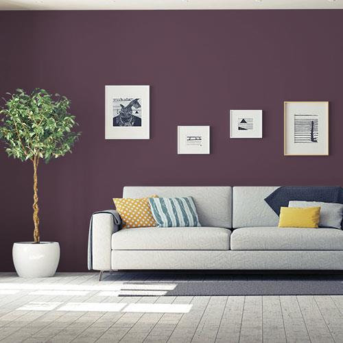
Rumors by Behr: Deep Ruby Red for Dramatic Spaces
Behr’s 2025 Color of the Year is Rumors, a deep ruby red designed to make a statement while adding warmth and rich allure. The wine-like color brings a sophisticated look to dens, living rooms and even kitchens.

Encore by Valspar: The Vibrant Blue Revival
An “atmospheric blue,” Encore is vivid and rich. Valspar says Encore represents blue’s comeback and “is an anchoring shade that embodies constancy and confidence to let you create a joyful respite from the ebbs and flows of life.”
The color’s deep saturation and violet undertone offers a crisp, cool shade to mimic the mood in virtual space, the manufacturer says.

Timeless and Authentic
Sherwin-Williams’ Color Capsule: A Palette of Nine Classic Shades
Sherwin-Williams bucked the single-color trend this year, offering instead a curated “Color Capsule of the Year” featuring nine colors: two bright whites (Sunbleached SW 9585 and White Snow SW 9541) and two deep designer favorites (Rain Cloud SW 9639 and Clove SW 9605) from the Designer Color Collection; two hues from their 2025 ColormixForecast: Grounded SW 6089 (197-C6) and Bosc Pear SW 6390 (139-C6); the modern-classic Chartreuse SW 0073; and two touches of softness with Malabar SW 9110 (205-C2) and Mauve Finery SW 6282 (190-C2).
“With so much information at our fingertips, we are looking for moments to connect with something real,” said Amanda Lowery, the company’s architectural services account executive. “Acknowledging the impact design has on our physical and mental well-being opens the door for unique and authentic spaces designed for each individual—spaces where we can be our true self.”
The nine hues work well together and are adaptable to nearly any design style and aesthetic. “There was a vintage vibe that we kept leaning toward when we were looking at the palette,” said Color Marketing Manager Emily Kantz. “Nostalgia is having a big impact on design. People are craving those authentic pieces of the past in their homes, so this palette pulled influences from those iconic design styles.”

Mapped Blue by Dutch Boy: Modern Charm with Timeless Appeal
Mapped Blue is a medium-tone blue with slight yellow undertones that the company describes as a timeless foundation ideal for adding modern charm while staying on trend even as personal styles evolve. A versatile option, it combines seamlessly with a range of color palettes—from elegant, tailored hues that balance comfort and luxury to essential everyday colors evoking minimalism and sophisticated simplicity to captivating options with deep, saturated colors blending warm and cool.

Love color? Check out our online design tools to experiment with siding and trim colors on a library of homes.
The post 2025 Colors of the Year: Versatile, Warm Hues for Every Home appeared first on Westlake Royal Pros Blog.